Odds and Ends from my brain and interests. Given that it is meant to be much like my old cartoon strip at the Lowell Connector, I suppose it is eponymous (I also like that it does make an oxymoron of sorts)

If there is to be anything here of any regularity it should be about sci-fi, computers, technology, and scale modeling with origami thrown in on the side (at least not infrequently). Oh, I would also expect some cartooning too

Saturday, December 31, 2011

Sentimental Spaceliner

Ruminating on the Orion III


    For those who were fortunate enough to see 2001 when it was first released, you know that one of the things that film created was an incredible desire to see this future when it got here. Well, 2001 has come and gone and that space wheel in the sky isn't there yet. Still the look of that future with its space stations had an air of reality that had been unmatched by anything we had seen before, except perhaps by those that read the famed Collier articles by Werner Von Braun and Willy Ley and illustrated by Chesley Bonestell. Oh well, the fleets of Mars ships have not materialized either.

    The imagery of 2001 came to mind again because of a small discussion on new color schemes for the Orion III shuttle on the Starship Modeler Forum  with regard to ideas for additional schemes besides those seen in the film. The reason for this discussion is partially due to the release by Moebius of a retooled version of the old Aurora space clipper kit. For reasons that are not readily apparent, it was released without Pan Am decals (copyright issues with either MGM or the rail company that inherited the name). Given that the completed model will give you a blank slate, it can be interesting to play around with the idea of how to color the ship when done. I drew up a couple of blank profiles to see if anyone wanted to contribute. After all, by the time 2001 came around, Pan Am didn't really exist anymore anyway. What about other contemporary airlines - and by contemporary I mean 1968, so...

TWA, based on the livery on the Moonliner rocket that was on display at Disneyland

or more defunct airlines, how about the flying colors of Braniff

BOAC, pre British Airways
I did do an actual British Airways Orion profile, and getting that tail flag flash is really tricky given that the Orion is essentially tailless aircraft.

Besides the blank passenger profile I made a quick cargo profile (detail note, the curvy fuselage makes fitting a Space Shuttle-like set of cargo doors problematic, so instead I drew in two
separate cargo hold sections). A figured commercial cargo version might have been used under contract by Flying Tiger lines, the air freight carrier of the 60s, or perhaps their successor...FedEx.

ANA airlines likes putting anime on their aircraft. I figured for 1968, what better anime character than Astroboy.

The alternate world of 2001, there was no NASA but rather AASA, the American Astronautics Space Agency. I based their colors on the later paint schemes of the shuttle.
    How about a presidential Orion III?
After all if Babylon 5 can have an
Earthforce 1, why not a Space Force 1 for 2001. Should look nice with that gold and blue trim.
    You could have an Orion III used to convey shadowy figures of an international movie corporation, which seems to have a huge budget for location shots on the moon. Could they be hiding something? For another Gerry Anderson reference, I also considered it as the seed aircraft by an airline in frequent need of international rescue.

A colorful one can be along the lines
of a Chris Moore'ish, Peter Elsonesque, Chris Foss-like, TTA universe Orion. A kind of industrial tropical fish look.

Starship modeler forum poster Justin "Bluesman" Miller posted a couple of contemporary airline profiles (posted with permission)
In spite of some apprehensive remarks about budget spaceflight by
fellow posters (well me) he replied that you can't beat the price and service with a stick. Well last time a flew a major airline, I recall the price and service couldn't be beaten with a stick either. No, wait, I got that backwards. I got beaten with a stick, that's right.
    Still a private sentimental version would be LAN Chile. I flew on them as a wee child back in '68, with cockpit tour! (Below Lan '68 and '01):

...yes I have one,...and in the end it will probably just be a Pan Am (for 2001, would have likely been a "billboard" version below), like the one I built in '75 (find references here)

Wednesday, August 17, 2011

R-2 Paper Model

R-2 Paper Model


I originally started out with this project as one of my first Blender projects. Unfolding went mostly ok, with a few unusual results. Getting the plan right was really tricky (even now, I'm not sure if the "length" of the rocket includes the aerospike or not).

There are two versions. A gray version based on a couple of fuzzy images found on the web. I suppose that early soviet research missiles were finished in a very light gray or whitish finish given images of early R-7 firings and some of the "geophysical" and "vertical" launches of R-2As and R-5Vs. In operational use, these missiles were finished in army colors; probably the same scheme as their transporters. I'm sure there are soviet army guru's that could get this right; I'll admit I did it by eye.

Operational missiles used a radio navigation system to help them more accurately hit their target. These guided R-2s are often shown with two small antenna aerials rear the nose. The only clear view of these aerials are on photographs of a Chinese DF-1, a locally built R-2 version where they are clearly loops.


Left:R-2 & R-2A prototype, Center:R-2 on stand, Left:R-2 next to some of Neil's V2s (Bumper + #59 repaint)
It is scaled to 1/96 scale (8 ft/inch or 1.04167%) which puts them in scale with Niel's V-2s and a lot of other stuff. The files were mapped to US letter sized, but I think they should fit on A-4 anyway (the image should be narrow enough if centered).

The Files: (on Google docs)


You need to use the File/download or save operation on Google docs to get them

More Information:

For more information about the R-2 missile itself, references and acknowledgments, read the previous post on this historic missile.
General recommendations: Use heavy paper instead of card stock. Prototypes built with paper over 40lbs are harder to work with on some parts. Best results with some special paper I got which is around 25lb (standard is 20). Try 28lb if you can find it (there is at Staples) or some of the cheaper photo-like stock which is around 35-40lb.
Coming soon, the geophysical R-2A sounding rocket. Nearly done, but getting the new nose cone and side canisters right is a bit tricky at this scale. Stay tuned.


Monday, June 20, 2011

The R-2: Their Russians were as good as our Germans

The Russian Stuff


A memorable scene in "The Right Stuff" was just after Sputnik were someone asks if "their Germans" were better than "our Germans?" This is rapidly refuted.

The brains behind the Reich's missile program had been Werner Von Braun. Seeing the writing on the wall, he gathered up as much of his staff that was willing and travelled towards the American lines in the hopes of being captured by the "right" side. Herman Gottrup, an electrical engineer on the project decided to stay put. During the occupation, the soviet government offered an "opportunity" to help work on a new East Block missile program. The soviets gathered these engineers under Gottrup to work on assembling some A-4s from what scraps remained in their zones and re-generating plans to manufacture new ones. Eventually, the Germans were collected and sent deep into the Soviet Union (for their health, or lack thereof if they failed to do so).

Even so, the Russians would have had a hard time reconstructing the German missile if they hadn't had capable engineers of their own. While before the war the Russians had supported some of the most successful pioneering work in rocket development under GIRD, these engineers had by and large fallen afoul of people within Stalin's government (most likely Stalin himself) and were largely imprisoned and shot. Sergei Korolev was one of these and nearly died in Stalin's gulags. The need to find out more about the new German weapon saved his and many other engineer's lives.

In the end a handful of German V-2s were assembled. The first real success of this Soviet missile program was to successfully build one from scratch. Korolev and rocket engine specialist V.P. Glushko managed to create a working copy called the R-1 (literally for Rocket 1). The missile itself was not much of a weapon. What was needed was a bigger payload, more accuracy and more range. Gottrup and his fellow engineers had been asked to contribute and they did suggest many of the design improvements that Von Braun himself had considered for the next generation missile during the war. As they continued their work, they considered building a new kind of missile, the G-1. Korolev on the other hand believed that working from the existing R-1 would provide a quicker development cycle and an easier to manufacture design.

The R-2

The design work for the R-2 began soon after the success of the R-1. The Germans pursued their own design, the G-1. It seems that the Russians liked the competition. The Germans themselves had little choice, trapped in a foreign country. By the same token, the Soviet engineers must have themselves been under pressure to succeed with their own design given the amount of resources dedicated to the effort.

In the end, the Russian engineers won, although it is a wonder if it could ever have been different. It seems that the German teams were kept very busy working on designs that were never implemented (G-1, G-2, G-3, G-4, G-5). The arguments for a "Russian" missile over the "German" one may have been successful purely on the basis of technical feasibility, on the other hand the mistrust and bad blood may have run deep. It is a situation perhaps not unique to the Soviets. The Nova documentary ("Sputnik Declassified" see refs) on the space race alludes to a similar situation where our German's effectively cloistered by the US Army worked on projects that did not receive the highest priority compared to non-German projects by the US Navy.

The R-2 (R-2/P-2, NATO:“Sibling”, SS-2, 8Zh38/8Ж38) consisted of several improvements over the R-1. Navigational equipment was relocated to below the main tanks providing easier access (I unfortunately can't find the reference now, but I recall reading that a ground crewman was killed by falling off the service platform of the R-1 while working on the equipment). The warhead could now separate from the main body of the rocket extending its range and accuracy. An integral alcohol fuel tank lowered the missile's total mass. Also, a new more powerful engine designed by V.P. Glushko (the RD-101) was incorporated into the newly designed tail. The end result was a more powerful rocket with twice the range and a third heavier warhead capacity than the R-1. While still not powerful enough to carry a nuclear warhead, it could carry a radiological “dirty bomb” that could disperse radioactive fall out over a wide area.
A few detail differences were that only two of the stabilizer fins had active control surfaces (an R-2 at a Russian military museum clearly shoes them on fins I & III). Curiously many images of the R-2A (see next paragraph) show markings indicating similar surfaces on all fins (meant for intelligence disinformation?). Another detail difference are antennas near the nose cone. The R-2 is cited as using radio guidance to improve accuracy. In photographs of the DF-1 (the Chinese copy) these appear as metal loops, but these loops are not as clear in other photographs, and instead appear more like rods. These rods are perhaps aerodynamic fairings for the loops. At any rate, these antennas do not appear on all images, and probably represent missiles that were actually meant to be guided (operational missiles).

The R-2A - "Геофизическая"


The missile was also developed into a sounding rocket, the R-2A* geophysical rocket. Some initial scientific work had been done with the R-1 by attaching scientific nose packages and ejectable pods on the sides. The increased capabilities of the R-2 provided an opportunity to really sample the interface between atmosphere and space. In service by the International Geophysical Year (1957-58), the R-2A was used for high altitude atmospheric and radiological research. It was also used for live biological experiments. Some of these were definitely directed for manned space programs as they featured actual animal space suits as well as various modes of live recovery. Indeed before Laika, many other Russian dogs had already been to space (if not in orbit), and unlike the various Alberts launched at White Sands, New Mexico, most of them came back (not all mind you). It was even considered as a booster for a manned ballistic space shot (the US followed this plan by preceding their manned orbit with the Mercury-Redstone ballistic launches).

Follow ups

Some links for additional information
  • Encyclopedic information on the early Soviet missiles at astronautix.com
  • Information about the R-1 and R-2 at russianspaceweb.com
  • A hard to find site with information about the early research at the Kapustin Yar launch site
  • Information on derivations of Von Braun's V-2
  • Great pictures of the Chinese R-2 at Martin Troller's flicker gallery as well as other shots of the R-1 and R-2
  • Nova documentary "Sputnik Declassified" (Another video not easily available off the web is the BBC produced docu-drama called "The Space Race")
  • Also, thanks to Thorsten Brand on the Space Paper Modelers group at Yahoo! groups for a key diagram for the R-2A I had not seen anywhere else.
*Searching for the R-2 can be difficult on the web. Star Wars references aside, there is the issue of cyrillic which results in the R-2 being actually P-2 for the cyrillic Paketa or "rocket" (which also may encode differently given that "P" and "Р" may not actually be the same). This is further complicated in the case of the R-2A because it can be Р-2A or В-2A which translates as V-2A which again confuses it with the German V-2 (the "В" is for "вертикальный" or "vertical", its main flight path).

Friday, May 06, 2011

Sci Fi Visuals: Spaceship Designs - The References

Here are some of the references I've looked at preparing this. They can be followed up for more info on spaceship designs:

Art

  • Sci-Fi-O-Rama - SF/F oriented art blog run by UK Designer/Illustrator Kieran Kelly
  • Golden Age of Pulp Covers - note site in French, but browsable without it. Follow links on the bottom (for instance livres means "books", vers means "toward") 
  • Desktop Starships - A huge collection of SF/F art for your desktop wallpaper. Galleries broken up by major popular subjects such as Star Trek and Battlestar Galactica.
  • An artist's alphabet at Tor.com

Some Artists

Spaceship Design:

  • Perhaps the ultimate reference for hard sf spaceship design - Atomic Rocket
  • Doug Drexler's blog, the Drex Files
  • Starship Modeler's builder galleries, specifically look for kitbash and scratchbuilt entries for original designs or designs inspired by traditional artwork, franchises, and stories (as well as humor).
  • David Mueller's "So you want to be a speculative spaceship designer" article. Browse around the site for more material.
  • Starship Schematics' site which collects designs for Star Trek, Battlestar Galactica, Babylon 5, and Star Blazers (Yamato) universes; both cannon and fan based.
  • Alas, Martin Bowers' website appears to be defunct which is a shame. He is a professional model maker who worked with the production of Space 1999, Flash Gordon, Outland, Alien as well as other projects. He has also created some amazing studio scale replicas of other ships. (In case it comes back, the link was http://www.martinbowersmodelworld.co.uk/)
  • Fantastic Plastic is a collection of plastic kits that documents our fascination for far out designs, real and fictional.
  • A definite lost gem was The Modeler's Reference Vault which had a ton of production stills as well as good quality captures from various movies (for more reference lost links see post on lost web pages).

Other Flights of Fancy:

  • Smithsonian Libraries Voyages Exhibition Focus on air journeys: A short page with some interesting images and notes of some early works about space and air travel.
  • Shuttle development: a small lost item of illustrated articles on heavy lift vehicles proposed as  either the next big thing after the Saturn V or the Space Shuttle.
  • Forgotten Trek: Blogsite to things almost Trek
  • The Terran Trade Authority which "published" the guide to space travel in the 22nd-23rd century.

Hard copy:

Books on hand (I can only comment on stuff I already had in my bookshelf).
  • The Art of Star Wars by Carol Titelman, Ballentine Books, 1979. The first of the "Art of..." books that started to be released with both this series and others. It's really great as a collection of concept art before Star Wars had a really established look. The "sketchbook" series that also goes along with the movies also provide some nice outlines for proposed designs for the film. 
  • The Art of Star Trek by Judith & Garfield Reeves-Stevens, Pocket Books Inc., 1995 (1997ed). One of many art of Star Trek books out there (along with fan art books). This one is nice in that it was rather comprehensive at the time of publication allowing the reader to see how styles changed for the ST universe over the years and across series.
  • Starliners by Stewart Cowley (Steven Caldwell pseudn.), Hamlyn Publishing, 1980. One of a set of books for the Terran Trade Authority universe which basically contains some of the better sf hardware cover art of the 70s with artists like Peter Elson and Chris Moore.
  • Visions of Spaceflight by Frederick Ordway III, Four Walls Eight Windows, NY, 2001. Really great collection of SF artwork, particularly preceding the Space Age, including much of the artwork for the Collier "Man in Space" series. 
  • Imagining Space by R. Launius and H. McCurdy, Chronicle Books, 2001. Collection of fact based artwork expanding on the perceived future of man in space as well as the still possible one.
  • Out of the Cradle, W. Harman, R. Miller, P. Lee, Workman Publishing Co., 1984 (1st ed). A really great collection of speculative artwork used in conjunction with essays on the future of man in space in the pre-Challenger era. Given that it's still available as new I would suspect that much like Harman's and Miller's "Grand Tour" book it's been edited for new content.
  • Alternate Worlds: the Illustrated History of Science Fiction by James Gunn, Prentice Hall Inc., 1975. I've had this book forever since I saw it at Korvette's. Full of speculative art and cover art dating back to Verne. The text is somewhat dry and scholarly (reads like a thesis), but great for early sf history.
  • 2001: Filming the Future by Piers Bizony, Aurum Press. The book to have for fans of 2001. It goes into great detail of the technical design of the film and it is lavishly illustrated.
  • Rocketship by R. Malone (with J. C. Suares), Harper Row, NY, 1977. Interesting collection of hardware ideas and reality with many sequences of comparison and contrast.
  • Out of Time by Norman Brosterman, Harry N. Abrams Inc., NY, 2000. Odd little book which was the first one I saw that really seemed to address the idea of future past. Covers quickly what the future looked like at different times and with respect to different topics (cities, cars, airplanes, etc.)
  • Packing for Mars by Mary Roach. While not actually on my bookshelf, I'm currently listening to a library copy and have found its content full of nice  little tidbits (such as VRI) that one needs to keep in mind if you are really going to put people in space for a long long time.
...and of course a long lost collection of notebooks and marginal sketches done when I should have been doing my homework.

Back to the beginning

SF Visuals (III): Spaceship Design - The Frameworks

No matter where you go, there you are

The working title for this section alludes to an undeniable fact about creative work which is that you can never remove yourself from the picture. By the same token, you can never really remove yourself from the world you live in. As much as visual art appears to make amazing leaps outside of what we are used to, following the influences of the artist often shows a clear path from one standard to a new vision.
    Spaceship conceptual designs are also influenced in much the same way and as a result can reflect the world they were created in. What designs look like can depend on many questions an artist can ask: How would it work? How do people travel in them? How do they fit with "bleeding edge" commercial design and art guidelines? How do they fit with the engineering of such a ship? Does it fit a look that I want? The answer to these questions can only come from something the artist has come to know.

The Rocketship

Allow, if you will, that the fundamental unit of spaceship design is the rocketship. This is really the only method of space travel that we know of first hand and can readily understand how it works. Beyond rocketships, we really only have flying saucers and other reports of UFO activity. The saucer shape, while not infrequent in motion pictures and illustrations, is limited in the vagueness of eyewitness reports and by our inability to know exactly how a saucer flies. It is also by definition always "saucer" shaped. The rocketship has no such problem; fire and thrust comes out one end, and it moves in the opposite direction.
sketch comparing filmed saucers vs. rocketships (not to scale). Saucers are by definition saucer shaped, but rocketships can come in many varieties. Saucers do have the benefit of generally using propulsion that's beyond explanation

Before Rockets


Trips to space predates by far the ability to actually reach space. The rate of progress by the 19th century must have made no idea impossible and perhaps explains the success of speculative fiction at the time. Still, our experience with distant travel was based on railroad cars and steamers. Not surprisingly the inside of Verne's Columbiad looks a lot like luxury travelling salon car. The idea of railroad car in space is particularly apparent in the design of the Edison spaceships in Edison's Conquest of Mars. At least these fictional design are starting to consider some real factors such as weightlessness and the vacuum of space. Spaceships of this time period are sometimes nothing more than super lifting balloons of some kind or the result of some mysterious lifting material. Even the Flash Gordon serials of some 30 years later would still have rocketships navigating between clouds as well as between planets.

Having conquered the air...

By the early 1920s, the rapid development of air transport must have made the idea of space travel inevitable. Still, the understanding of how it was to happen was perhaps not clear (The NY Times eventually apologized for criticizing Goddard's physics regarding rockets and travel in a vacuum). The pulp cover designs are full of basically rocket aircraft, perhaps inspired by the scenes of air racing and experimentation shown on the newsreels.

The "Streamliner" is a generic representation of the spaceships prevalent between the 1920s and 40s. In film, typically a finned rocket propelled by sparks and smoke.
    Design was also influenced by the idea of streamlining and Art Deco which was so much a part of commercial design during this time period. The classic rocketship design used in the movie "Just Imagine" shows this influence. It also became a seminal design for many movie rockets as the ship and its copies were re-used countless times in the serials of the 1930s.

Once you have seen the real thing, though...

What the real thing look liked became terribly apparent at the end of World War II and so the shape of the V-2 became the emblematic shape of the spaceship. The classic finned needle nose design, with it's smooth shape, and near windowless aspect became the standard to which many ships were designed. Looking at covers of pulp fictions and the ships of such films as "When World's Collide", "Destination Moon", and "Abbot and Costello Go to Mars", the German rocket's lineage is clearly visible.
The post war spaceship was heavily influenced by the Von Braun's V-2. The long slender ships were typically singly staged and with only slight variations in their fins.

Spaceships in the Space Age

Curiously, the V-2's designer got the opportunity to put in print what people carrying orbital ships would probably be like in a series of Collier magazine articles. As a result ships are more frequently designed with stages, or fuel tanks, and more spindly for operation in the vacuum of space as Von Braun and others designed them for the magazine and subsequent Disney documentaries.
Post Collier designs often featured girder work and visible tanks. Streamlining was reserved for ships that actually traveled through an atmosphere

While not often seen in films of the time there are a couple of notable exceptions: "The Conquest of Space" (1955) which was heavily influenced by the Collier designs and the Russian movie "The Road to the Stars" (1958). Ships with visible fuel tanks and girder work instead begin to appear more frequently in SF artwork around this time along with speculative non-fiction works.
     Artists also appear to be inherently more aware with what space hardware might really looks like. Perhaps as a result of wartime experience or actual interest in current aerospace, illustrators and designers start to incorporate typical details that are visible on military equipment such as stenciling and warning decals. They also start to weather the models to reflect usage and exposure to the elements (curiously absent earlier on these models in spite of the fact that it was an age old technique used with more traditional subjects such as railroad cars and ships). One of the first studios that excelled at this type of design were the model makers who worked on Gerry Anderson's popular puppet sci-fi shows under the direction of Derek Meddings.
Some space age designs began to incorporate the types of markings visible on then contemporary military craft, particularly things such as warning marks, panel lines, and instruction decals.

The greater familiarity with real space going hardware also started to influence the look of some designs. An interesting similarity exists between the Lost in Space "pod" and the Apollo LM. This is particularly striking given the rather spare design of LIS's hero ship itself - the Jupiter II saucer.
The "Lost in Space" pod from season 3 (1967) is on the left; the Lunar Module is on the right, much like it looked in press releases between 1966 & 67

Filming the Future

Of course the truly "wow" event for science fiction film was the release of 2001:a space odyssey. In this case the design was made based on then current engineering proposals (all of this is wonderfully documented in Piers Bizony's Filming the Future, see refs). The designs also incorporated many elements that had been used in film models for years: large scale models, weathering, subtle paint variations, and lots and lots of details even if they would not be clearly seen on screen. All of these things would work to create the illusion of size and functionality.
    The wealth of small details such as pipes, radiators, gears, and boxes stuck on these models have come to become known as "greeblies" and have been a dominant aspect of screen starships since. They are particularly important as part of what is called "kitbashing" where parts from model kits (or even everyday items) are assembled together to create a design that photographs well (sometimes cheap kitbashing can make use of highlighters or disposable razors to make engine pods as shown in an the Star Trek episode of "Reading Rainbow").
    The post-2001 ship was typically long, heavily greeblied with odds & ends, painted white or off white, contrasted with gray weathering & panel lines.
Since 2001, filmed ships have used these basic techniques to create fairly realistic looking designs. It has come at the price though of a certain sameness to many of the ships. The designs have a gray aspect to them, and the profusion of greeblies even in situations where streamlining makes more sense (such as atmospheric or watercraft). There is also a rather common design element, an equatorial seam. The reason for this last bit is unclear, perhaps because it was good for hiding physical seams for circuit access inside the physical model.
    Outside of film, the variety of designs are just too great to number. It's unfortunate that some of the neat shapes seen in covers by artist such as Chriss Foss and Peter Elson didn't make it to film (Chris Foss did work on early concept art for the "Nostromo" and other designs in "Alien"). Still, the look of many of these covers have been influential in the ships that appear in current video game titles such as "Homeworld." The colorful designs owe much to comic book art and pop art elements. Outside of Barbarella, comic book inspired design can be seen in the flying taxis and luxurious space ships created by comic book artist Jean-Claude Mézières for "The Fifth Element.".
A comic book styled rocketship, somewhat flat and under-engineered, but colorful and pretty. It provides a contrast to the greyness of most film ships.

Where to now?

Well, there are many possibilities. For film, the period between the 60s through the 90s was dominated by the basic need to create physical models that photographed well. As computer power has increased and gotten cheaper, the ability to create a wider variety of designs is now possible. There is the possibility to revisit older types of ships and get them to look more sophisticated than just silver painted wood. Complicated and yet extremely detailed work can now be rendered on any scale with the same model. Also it has never been the case that spaceships have to be rocketships (just very common). As mentioned earlier, flying saucers already benefit from strange forms of propulsion. At times, the desire to be totally alien demands that whatever you come up with, it should not look like anything you have seen before or have elements that defy what you would consider explainable. Computer graphics have greatly enhanced the capabilities to do the latter as modes of operation can involved disjointed physicality or weird fluid motion or shape.
Comparative sketch of just a few spaceships that are not saucers or rocketships. The classic reason for most of the illustrated ships is that the way they work is totally beyond our understanding (the space clipper was probably meant to be an allusion to the swashbuckling movies of old)

    Just as current artists have a wealth of art history to draw upon, starship designers also have a huge set of material to draw from, either the design elements of 19th century or modern (or post-modern) artists. Moreover, the tools for creation and dissemination have become cheaper than ever. It will be interesting to see what will come up next.

Last page - Links and References

SF Visuals (II): Spaceship Design - Realistic to Fantastic

Full steam ahead Mr. Scott

I found it interesting to note that SF ship designs can be seen to range from realistic to fantastic on the basis of their speed. Of course, the required speed is often a function of the plot. If the story requires our characters to simply travel from earth to orbit, the ship doesn't have to depart far from what we are familiar with. Since the trip itself is relatively short, there isn't much need to focus on the ship or the trip any more than say any drama focuses on the trip from Honolulu to LA (unless there are snakes on the plane).
    When the distances become longer, then the trip needs to be faster. This leads to some inevitable problems with what we currently know about space travel. For one thing, space is really big (see HHGttG). So even a trip to the Moon, let alone Mars is not a minor expedition. With current technologies you need a lot of fuel and supplies, and it will take quite a long bit of time which, dramatically speaking, will be boring. Outside of stories making a point of how incredibly boring this is, one would try to avoid this. It then becomes necessary to push the envelope making the trip faster and way more efficient so we can carry less fuel becoming in a strange way more "realistic" since you don't need a super carrier sized ship to move a dozen people (or less). Eventually as the distances become greater, say from star to star the velocity needs to get up to light speed, or c. At this point the design could be said to race to "fantastic" infinitely fast. This is because theoretically nothing can go faster than light (see any number of detailed discussions on the limit). This puts a real bind when you want to go between multiple star systems fairly quickly. You will need to find loopholes or gimmicks to justify the much higher speeds (and not even mention the nasty bits about time dilation and relative time paradoxes well beyond my scope). Ultimately we may even talk about traveling between galaxies so the ship needs to be truly fantastic. It's neat how in the few stories I've seen about traveling to another universe, you hardly ever need a ship at all.
      By the way,  I quoted realistic earlier because I think there is also something else operating in the design of SF ships. There is an inherent understanding that in space operas we often want the world to be a lot like our world (SF as metaphor for reality). Quite frankly, your average merchant family doesn't own or operate supertankers and fleet carriers. If you want your freelance space merchant or privateer to go from place to place in her ship, well it's got to appear realistically affordable. As a result many of the ships we see while not apparently fantastical in capabilities should be noted as fantastical in affordability. Just think about how we can barely put together a space station between the wealthiest and most powerful nations on earth right now.

Table of realism

Looking solely at speed as the main factor in fantastic design, I came up with the following graph.
2 axis graph illustrating realistic engineering versus fantastical with respect to speed
Realistic to Fantastical Engineering vs. Portrayed Speed
Reality is basically below the effective 0 point of the graph. Just above it is "realistic", meaning the design is based on known physics and the capabilities of existing engine technology and theoretically proposed technologies. Note that beyond the speed of light, there is really just a big question mark as there is nothing known that could really exist there. Just above in "realistic" I can't totally discount that people have written about the possible existence of loopholes such as wormholes or distortions of space time, but there are very few designs that apply these theories directly as they really don't have any engineering to back them up. Still if you leave the actual engineering out and just use the vocabulary, that half of the graph can definitely be populated.

Which designs fit where

We can start looking for the most realistic ships being ships that are limited to the immediate future or even a contemporary setting. Ships limited to travel between the earth and the moon and all points in between can follow existing designs very closely. Moving slightly further in capabilities requires a slightly greater technology, but many portrayals of ships that only need a slight increase in capability don't stray too far from what we know.
     The exploratory ships from Gerry Anderson's "Journey to the Far Side of the Sun" show strong influence of the concurrent designs at NASA for Apollo and lifting body programs. Even the Messiah from "Deep Impact" creates the notion of a current hodgepodge by actually using ISS and shuttle components in its design. Pushing the speed envelope some more, the designs for the spindly Antares from the late Defying Gravity and the Pegasus from the BBC's Voyage to the Planets docu-fiction (on which Defying Gravity was based) contain many very realistic elements.


2001's Discovery command module was designed to be in keeping with ideas about a real inter-planetary ship. The CM was placed far from its reactor, it was equipped with auxiliary engines, and large enough (in theory) to contain a centrifuge to provide artificial gravity, a space pod garage, a substantial computer core, suspended animation systems, and supplies for a minimal crew for several months of travel time.

     Reaction drive is the most frequently used mode of propulsion through space. While there is some arguments about the mechanics of these engines (engine bell design, firing times and so forth), we are familiar with how they work and they can be seen in all kinds of designs from realistic to fantastic. Ships such as the Discovery in "2001: a space odyssey" travel using nuclear rockets at speeds that are expected with such engines (travel to gas giants in several months to a year). The show "Salvage 1" had a ship called the Vulture that took into account affordability by being made of recycled materials and using dangerously explosive fuel to preclude a Saturn V sized vehicle. The Eagle from "Space 1999" also uses reaction engines in a way that seemed perfectly normal for a ship whose initial purpose was to act as a shuttle between the moon and low earth orbit, particularly with its non-streamlined, let it all hang out look. The show's need for speed though starts to push the believability as scenes imply capabilities of relativistic speeds for a rather small ship with obviously tiny fuel capacities. Still, the Eagle does recognize the need for control jets for maneuvers; a detail that is often missed.
     The usage of more exotic realistic propulsion systems are not always seen in spaceship designs and this is probably because, truth be told, its generally not pertinent to the plot. It's just so much easier to put a lit engine bell on it and leave at that. The starship in Avatar is noted as one of the most accurate portrayals of a possible starship. This is not accidental as a good deal of research went into putting the "Venture Star" together. The single pilot episode of Vituality featured a ship, the Phaeton, which used a nuclear pulse drive like the one originally proposed in the 1960s for Project Orion.
     Once FTL travel is required in the story, there are two solutions. One is the loophole, typically a wormhole or mechanism of "jumping" from one point of space to another. Such vessels tend to stay close to current knowledge about space travel, i.e. reaction drives, distances on the order of 100s millions of miles not light years. The shorter "real space" distances allow for observing orbital laws, g-forces and the like in a more realistic fashion. The second method is to have new physics so you can travel faster than light. Anyone designing for this type of mechanism is free to invent more exotic engineering.
     The requirements of story telling (and production budgets) often adds some unrealistic elements even to designs that try to follow some of the rules. Not counting the ships of phenomenally advanced races who know a whole lot more about space travel in these stories, You can find ships that use reaction drives of phenomenal efficiencies or have no visible means of fuel capacity or heat dissipation (notable given the energy requirements that one would think they need).
     So what about forgetting about the physics already. A classic case are the Irwin Allen productions were the ship was really just a box for the characters (that was frequently tilted from left to right as sparks flew off the computers). Exactly what moves the Jupiter II is a total mystery (as is the number of decks that are really crammed in there). Interestingly this was also important to Gene Rodenberry when he requested that Matt Jefferies design the Enterprise with no traditional propulsive technology. In a sense, he was being very realistic in realizing that the fantastical speeds required for his stories were beyond any capability even conceived of at the time, so why dwell on it.


Some "drive" systems which were really not explained or shown to fit with currently known physics ("the science of..." books not withstanding), which is really just fine. What could be better than to power a time machine with a banana peel?

So why dwell on it?

In some ways there really isn't any reason to do so. If what you are interested in is a good story or something visually interesting it shouldn't matter much at all. Yes it is upsetting to those who know some physics when stuff is blatantly wrong and incredibly refreshing when someone goes through the trouble to get it right. The question remains, however, because I know many people love a good story without letting themselves get bogged down on the engineering of it all.
    Take for instance a design that I think sits way up in the fantastic stratospheric right of the graph: the Lexx. The ship itself was so foreign and gorgeously rococo, with its bio/mechanical design style.  It has no obvious means of propulsion (occasionally it does seem to exhaust propellant, but it has no obvious exhausts) and it goes at whatever speed necessary, from star to star, from galaxy to galaxy, universe to universe. While this puts the Lexx, and pretty much all the space hardware on the show, into the realm of what George Lucas called science fantasy, I wouldn't have allowed myself to let that get in the the way of a good story.
     So, if you really need to, there are people figuring out exactly how a Starfury's  engines are fueled and books published with cross-sections of X-wings and Tie fighters for you to enjoy. I'm just happy if it can get the hero to the planet on time, and look cool while doing it.

A brief postscript:

...and besides all the high-tech, where is the bathroom anyway?

Next: The Frameworks

Sci Fi Visuals (I): Spaceship Design - What's Up Doc?

Up and Down-ness

We live in a basically 2 dimensional world (if you scale movement through the air with the actual size of the earth's surface, you'll see what I mean). Not surprisingly our design for spaceships shows this two dimensionality. This isn't to say that the representation of a strict up and down in micro-gravity is universal, just very common.

"It's a trap!"

In Star Trek 2, Spock makes a comment about saying, "he is intelligent, but not experienced. His pattern indicates two-dimensional thinking. ." It illustrates how we are mostly experienced with 2 dimensional patterns. People still think in terms of a Mercator-like concept of east-west, north south, coordinate systems. It is sometimes a surprise to note that the shortest distance between Seattle and Tokyo is actually via Alaska.
     This flat type of thinking and experience influences our imagery of what these ships and environments would look like. A classic example is the space battle in Return of the Jedi. As we recall, the rebel fleet is approaching the Death Star in orbit around Endor from hyperspace. As the fleet pops out into real space we see the fleet approaching the Death Star in perfect up/down orientation.
Rebels approach Endor aligned with Death Star, veer off, and consequently aligned with Imperial Fleet, apparently on the same plane
     So we expect that a fleet that jumps in from any point in space, reappears perfectly aligned on their target, carries out an emergency maneuver to again be perfectly aligned with their next target? Not really, but it is probably understandable that if the imagery were more explicably at odd angles, it would take longer for the audience to understand what is going on. Also, films are panoramic, showing widths preferably over heights, so the subjects need to spread out along widths just to fill the frame and not radially along any direction. There is also perhaps a prejudice to photograph the cavalry charge, with all its drama. Watching the battle scenes from DS9's "Sacrifice of Angels" it's no surprise that with all the references to the "Charge of the Light Brigade" the climatic scene is indeed a charge from the dynamic right to the fortress enemy on the left (while the battle scenes are like Errol Flynn's  Charge of the Light Brigade, they reminded me more of Bondarchuk's Waterloo french cavalry charge.)
     Still, it's not impossible to do this differently. Some of the battle sequences in episodes of the new Battlestar Galactica and Babylon 5 do sometimes have assaults at odd angles adding to the confused nature of such types of battles (or any kind of battle really). It is also something that with the advent of first person space battle video games we are coming to expect visually.

Horizontal Design

While the horizontal flight of ships within fleets and orbits is really only noticeable because the ships themselves have a rather familiar sort of up and down design as well; by which I mean perpendicular to the direction of travel like an airplane or a ship.
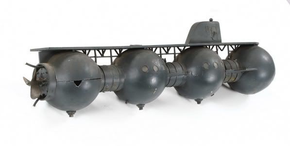
     Some of the earliest form of fictional manned rockets have the decks aligned with the direction of travel. One of the first realistic designs was from the Russian pioneer Konstantin Tsiolkovsky. Aware of the forces of acceleration, he aligned the decks with the direction of travel.
Tsiolkovsky's rocket places passenger spaces on the nose of the rockets, with the decks stacked along the direction of travel.
It is a design that makes practical sense given the forces involved. Einstein himself noted that for practical purposes there is no difference between a gravitational field and a ship undergoing acceleration. Such designs for ships also include things such as handholds and magnetic shoes for support from walls and ceilings once the engines are off.
    Passenger transport at the end of the 19th century consisted of wagons, train cars, and ships. All these vehicles naturally have their decks arranged perpendicular to the direction of travel. Eventually passenger aircraft also followed similar deck arrangements. While in all of these vehicles vertical movement is not unexpected (some more than others), it is not expected to be dominant (in which case you are often in serious trouble). The most important force for the passenger would be is gravity itself.
     This deck arrangement is a very strong design element and dominant in most SF ship artwork out side of the post World War II period (excepted then perhaps because of the dominant example model being V-2s). Not counting ships that actually make landfall, where deck alignment with respect to landing position makes sense, some famous (admittedly film) spaceships that follow deck layouts perpendicular to the direction of travel are: All of Star Trek's starships, Battlestar Galactica, Star Wars (Star Destroyers, Rebel Star Cruisers and frigates), Roger Young (Starship Troopers), most Babylon 5 ships and on and on etc. and so forth. A great web page to compare spaceships by their direction of motion (left to right) and deck arrangement (by window rows) is Jeff Russell's Starship Dimensions.
     There are some notable exceptions. Perhaps the most common occur in post war SF pulp covers and movies where the ships were mostly V2 variants. The Mars ship (featured in this post) in Conquest of Space is neat in that it goes from free-fall in orbit, to acceleration along the length, to horizontal, and back to vertical and the design accounts for all states. Another memorable exception in film are the ships in Kubrick's 2001:a space odyssey. While Kubrick's Discovery does show some of the standard up/down decks, their placements are Escher-like (see image), with the Bridge windows being located apparently on the ceiling and crew members standing in odd directions or spun, and of course the centrifuge where down is out  and up is towards the center.
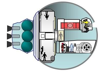
     An interesting realistic design to allow for both artificial gravity and adjustment when under acceleration of the ship was created for a plastic model kit called the "Pilgrim Observer" space station. Designed by a NASA engineer, it was proposed as a possible upper stage for a Saturn V. The idea is to equip the ship with gimbaled arms containing the living quarters. The arms are folded in for launch and then swing out to 90° when not under acceleration. If engines are operated, the arms can swing back to maintain the apparent "g" force perpendicular to the decks.  Similar designs have been proposed for Mars missions.

Up and Down...really

On the other hand, it is perhaps a bit too easy to criticize this aspect of most SF design. Particularly in the case of film, because ultimately it can only be filmed on earth and it's a lot easier (and cheaper) to walk people from scene to scene down a hall rather than float them there. So, if a ship has artificial gravity and momentum compensators (of something like it), standard decks are just fine. The late Defying Gravity had the interesting gimmick that their hair and clothing were sprayed down with magnetic particles to give it that 1G look.
     Another thing is that a sense of up and down is perhaps more necessary than we may think. At the very least, we need some form of coordinate system to navigate about our space. Difficulty in navigation in space stations has been documented, in particular during emergency situations where relayed directions were required or navigation in areas with few navigational cues took place (Charles Oman, Human Visual Orientation in Weightlessness, in Levels of Perception, L. Harris & M. Jenkin ed., Springer Verlag, 2003, pp. 375-398). Look closely at the hatches of the modules on the ISS pictured below. Yes they are in free-fall, but there is a definitive orientation to the station. Note the stickers denoting Overhead, Deck, Port, and Starboard. The last two are particularly odd given that it doesn't really have a propulsive motion (i.e. a forward direction) as such, but I suspect it needs a forward and an aft as well just to make it simpler to find stuff (Monty Python fans may recall a short skit based on how to give directions for finding the claret during the History of Ballooning episode).

     Another issue is our own needs for a consistent up and down-ness. While recently listening to Mary Roach's "Packing for Mars" I learned about a space sickness phenomenon called "Visual Reorientation Illusion" or VRI. VRI results from the sudden 180 degree shift in perception of what is up and down. It appears to be triggered by spaces that lack a definitive floor or ceiling, or by seeing a fellow crewmember  upside down and can result in a sudden onset of nausea. The recommended treatment is for all crew (not just the affected member) to immediately take a consistent feet down position (Oman, pg. 380
     The Tate in Space was an art program that sought architectural proposals for an orbiting art gallery. It is interesting to note that all the entries take advantage of the lack of a specific up and down and encourage the patron to view the art from new angles so to speak. The ETALAB's entry is perhaps the most interesting in this respect at is is designed to be dynamically shaped so what is a wall or a floor is not only relative but changeable. Given the nature of VRI, I suggest these orbiting museums provide plenty of little bags.
     The very idea of not having an up, or at least a changeable idea of up is itself emotive of space travel. It's perhaps the reason that Kubrick couldn't give up that chance to point out that in space what is up and down is relative, even if it made the ship's internal arrangement more mysterious. I think that mystery was the point.
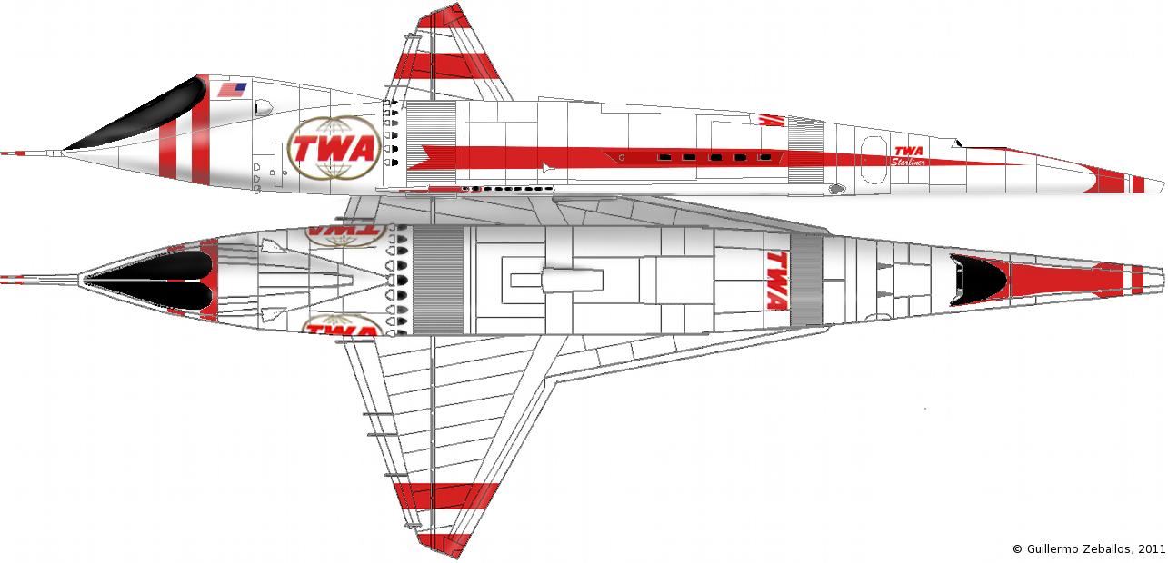
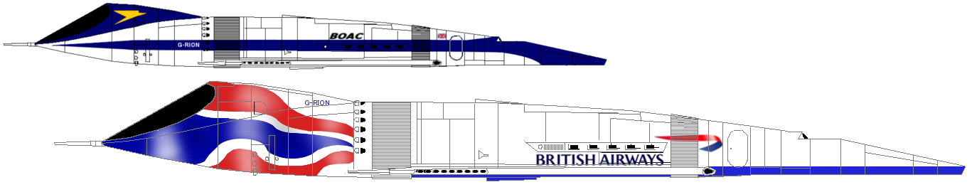
Next stop: Realistic  vs. The Fantastic

SF Visuals: Spaceship Design - Some Thoughts...

...about fictional spaceship design.

A couple of weeks ago I attended a  short panel at Boskone titled "Spaceship Design for Artists." The panelists were Irene Gallo, art director at Tor, Jordin Kare, physicist at Lawrence Livermore, artist Gregory Manchess, and artist Dave Seeley, who appeared to be a late addition (he was not originally listed in the program).
     The discussion was mostly dominated by the artists as they had put together several examples (Vincent Di Fate, Jean Pierre Normand, Syd Mead, John Berkey and others). Mr. Seeley was also kind enough to have several of his images available for more detailed discussion about how his illustrations were developed. He described how he used a combination of different methods in his work, from traditional painting to computer tools and physical models. An hour was unfortunately not quite long enough as there wasn't any time to ask more questions about design and get a sense of what they "thought" about design, as opposed to the mechanics of coming up with something. Jordin Kare, who could have addressed some "hard" design issues, and Irene Gallo who could have addressed some of the production issues, hardly got said anything at all. I wish there had been more time to flesh the topic out a bit more (in fact there is a really good posting by Irene Gallo on the development of the Tor.com logo, named Stubby The Rocket, and the development of the steampunk version, the HMS Stubbington).
     Needless to say, I was left a little hungry on the subject, so I figure I would organize my thoughts around a little essay here (and a couple of threads on starship modeler's forum). I do like spaceships, but I really wasn't sure what to expect from the discussion on design or what I would get out of it. What it did do was make me think more about what actually goes into the design of a very large technical piece of equipment that is really absolutely fictional. My first thoughts were the following:
  • First: A prevalence of certain conventional design elements about what is up and down. Dave Seeley pointed out early in his slide set that many designs are designed with a terrestrial "up" and "down" sense like ships or aircraft, even when they encounter each other such as a battle sequence. This may make little sense in free-fall conditions
  • There's a range between "realistic" (within an sf context) and "non-realistic" or perhaps more kindly put as "fantastical" designs. This range tracks nicely with velocity: the faster it goes the more fantastical it becomes. Einstein might say at "c" it races to fantastical infinitely fast, but actually I say there are efforts to do ftl in a way that "works" with more theoretical (and perhaps wacky) ideas for finding a loophole to current physical limits (wormholes, space/time warps, etc.).
  • A "spaceship" is not designed apart from a certain "culture" of design. What I mean is that certain design elements can sometimes become very central to a certain look in currency, such as oversized V-2s in the 50s, over-greeblied post "2001"ships, colorful Chris Foss-like ships, or folding current aerospace elements into "SF" craft. This last bit probably explains how the "rocketship" seems to be the fundamental unit of SF craft.
   As I was putting this together it actually got quite expansive, so I will be breaking this up into several postings: I'll tackle each point separately and then leave some handy references for where I pulled some of this stuff out. 

First stop: What's Up Doc?

Table Of Contents

  1. What's Up Doc - talking about how what is up and down influences designs
  2. Realistic to Fantastic - how does realism fit into sf ship designs
  3. The Frameworks - how does our environment influence designs
  4. The Refs - a short compilation of some of the references used


The "Heart of Gold" which is like a "sleek white running shoe"


Monday, February 21, 2011

Mod Mon Eventually....How I worked with Blender

Recently I read a post on the sf paper modeler's group on Yahoo asking about making paper models using model unfolding software. Well, I recently started using Blender and it's paper model script to create some stuff and so I replied with the following:

...What I've been doing (and bear in mind I've only started a couple of months ago with blender) is the following:

    1st: I get 3 views of the subject if possible (top, left, front), and opposing 3 as well if necessary (bottom, right, rear)
    2nd: I insert them into blender's orthogonal non-persp views as backgrounds with a certain amount of transparency. I scale these bg images with respect to the 1 inch scale or starting reference solid.
    3rd: Add the solid that best fits the part to be modeled. I've realized that in many cases modeling the whole thing at once makes it harder to unfold a reasonable part*. I'll try to use the simplest starting point possible, so if it's basically a box, I start with a cube. A symmetrical hull is really just a distorted cylinder.
    4th: Edit the solid along world axis lines as opposed to freely over 3d space and matching the tape to the background view. This last bit is tricky for hulls as I don't have accurate hull section plans for SF subjects (or any subjects really) so to some extent what I've done for the curvier subject is simply start at the front and work my way back trying to maintain the continuity of the edges.
It's at this point that someone said, that sound's great...hope to see some stuff. Well, it can still take a while to put something together. Even though I'm still too much of a newbie with Blender to write a true tutorial, I thought even a general overview of the process I used for one model would be helpful. Blender is not an easy tool (all 3D modeling tools are somewhat tricky). What makes most 3D modeling software difficult is that one can only use 2 dimensional I/O (mouse and screen) to create 3 dimensional objects. Blender can also be particularly difficult as the developers have consciously moved away from a traditional "Windows" GUI style to one geared around views and functionalities based on context. Blender relies more on the keyboard and buttons rather than dialog boxes or tabbed properties. X11 users should have an easier time with it. The version in this blog posting is Blender 2.54 beta.
     I have been really interested in rounding out the early rocketry models from Neil's paper modeling site. Besides his "Bumper" kit, I repainted one as US V2#3 and another as #59. I also thought, having some US V2s, I should also have some Soviet V2s - namely an R1 (Scunner) and R2 (Sibling) missiles. These subjects are particularly interesting since, unlike the US, their V2 variants were operational and in production for military and research uses.
R1, R2, R3, and R5m missiles scaled comparison (P. Gorin in Chertok's Rockets and People:Vol 2, p. 149)
←The profile on the right is from page 149 of "Rockets and People" by Boris Chertok (vol 2) which is available from NASA's online document servers
     So item one, I need a 3 view. Well for this example let's concentrate on the R2 because quite frankly R1 is just a V2. Now a nice thing about rockets is that they are basically symmetrical radially so all I really needed was a side view. This was a tad tricky since it's not like the Russians made a lot of this information public, but I did find various images on the web.
buttons for background image setting in 3D view context So starting with a profile, I inserted it into Blender using the background image insertion feature (right side 3D view panel). The resulting image was then offset and centered to where it would be easy to work with. In this case centered on the R2. It was ok to make it visible in all orthogonal views even though the XY plane was wrong, but for this shape top and bottom views were irrelevant.
semi transparent background profile inserted
At this point I added a solid to sculpt the shape from. For any classical rocket shape, the cylinder is perhaps the best starting point (from the "Add" option on the "info" panel). The cylinder was moved (grab function - "g") and centered over the view (either ZX or ZY plane) and in this case the top of the cylinder was selected and pulled upwards (first selected top edge + selected edge loop + top face center vertex, then grabbed along z only: "g, z"). I then selected the central point on the top face and pulled it up along the z axis to create the nose tip (below right). I then selected the ring of vertical edges and subdivided them several times (below center left)


stretch cyl. 
and nose
section cyl.scale to fitDone
The individual edge rings were selected and moved up and down to match appropriate heights of the intended shapes; the prospective seams if you will. Then with the ring at the right height, the ring was scaled (plain scale so as to scale evenly along the ring plane) so that the diameter of the ring matched the profile (above center right). This process was repeated from top to bottom (above right).
seam mark/unmark buttons (3D view context)
3/4 view with seams markedThe last step is to mark the seams for the paper model plug-in. While the paper model plug-in will create the seams for you, it will follow your marks preferentially (at least the last time I checked the FAQs). In order to prevent some version of THE Flying Spaghetti Monster, I marked what I thought were the logical seams. Each ring from top to bottom and one vertical edge from tip to base. On the following image of the model you can see the marked edges as red (this is a slightly angled view from top to bottom). Now blender can attach a texture to the skin of your model, but I haven't mastered that yet so the reader will have to follow that up for themselves. Instead I'll go straight to exporting the model. This is done from the "file" option under the "info" context menu.
Exporting through paper model plugin

When you export a paper model, besides the project name (you may get several individual files using the  model name as a base prefix), you can define the printout scale and the size of tabs. I shy away from most tabs so I won't focus on this too much. The printout scale can be a problem. The script will not automatically scale to fit the largest part onto a sheet of paper. You do get some information about how big the part/page mismatch is so it is possible to quickly narrow down to a workable scale factor. The more important thing here is to pick a relatively high image density for your output. If you stick to anything below 100dpi you will see jaggies and if you want to work on the image afterward you will be limited. Instead go for something around 200dpi at least. As a rule of thumb, for those who want to size their images conservatively, dpi should be at least half what you want to print it at. I like printing at 300 on inkjets and 600 on laser so files of around 200 work pretty well for me. Once you finish the export you should get an svg file (scalable vector graphic) with the parts in their raw form (if you can texture them, you would basically have a finished model now).
R2 parts thumbnail


Thumbnail of R2 parts as generated

     The script is nice in that it will automatically generate multiple pages if you need them, the limiting factor being only the size of the largest part itself. This points to the importance of marking seams. I could conceivably make this rocket shape with only one centipede like part. If I did that though I would have to make it rather small to fit onto a page. By purposely marking smaller sections, packing parts to a page should be easier and done to a larger scale. This is important as "jaggies" are less of an issue at the large scales on curves and diagonals.
     Now the script isn't perfect. Part placement is curious and in many ways not ideal. The packing algorithm tends to push parts to the edges so losing an 1/8 of an inch on a part corner is not unusual. It is also not unusual for parts to be cut haphazardly if you don't mark seams beforehand. This is part of the reason I like the idea of finishing off the parts separately. I have also noticed that fairly frequently the parts are very distorted. I don't know exactly why, but I suspect it has to do with shape complexity and non-coplanar surfaces. A 3 point plane is always co-planar, but a 4 point plane can hide a saddle surface so that this shape is not directly unfoldable without introducing some seams somewhere. This version of the script will warn of such faces, but in general I have found that the best trick is to keep your unfold objects simple and only have triangular faces around what will be problem areas.
    I'm currently positioning, painting, and fine-tuning the parts for this "Sibling" and I am planning a future post with finishing details on the R2.  In future I am also planning to post a similar Blender work through for something with a trickier shape (Cargo version of Aries 1b? hmmm).