Odds and Ends from my brain and interests. Given that it is meant to be much like my old cartoon strip at the Lowell Connector, I suppose it is eponymous (I also like that it does make an oxymoron of sorts)

If there is to be anything here of any regularity it should be about sci-fi, computers, technology, and scale modeling with origami thrown in on the side (at least not infrequently). Oh, I would also expect some cartooning too

Monday, December 03, 2012

Mod Mon: Current WIP and lessons learned so far


In preparation for Arisia 2013, I've started to look for a simple model that will fit in 2 pages and be built (or at least mostly built) in about an hour. As usual, foregoing the Borg cube because it's a little too quick, trying to find both interesting and easy is proving rather difficult. So currently I've been following several tracks simultaneously.

The candidates are:
    snapshot of possibilities
  • The Last Apollo, the CSM for Apollo-Soyuz
  • The Narcissus, in a greatly simplified format
  • The Dark Star, perhaps including bomb 20
  • The LIS space pod, pretty orange
  • C-57d, a simple saucer
  • General impression of a typical London police phone box from the 60s
For the winner, I'll have to get back to you later, but for now I figure I could pass on some insight into kit design and some Blender paper unfolding foibles I've run into so far.

Keep it simple


The object of using Blender is to make creating parts for the kits easier, not creating a 3D model of the object. Thus there are a couple of important things to keep in mind: first, I don't need the whole object, and second, the fewer the polygons, the better.

Port engine assembly for Nostromo model on Blender
Port Engine for Simple
Nostromo model. No starboard
engine drawn since it is identical.
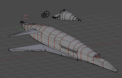
Why don't I need the whole object? Often the subject express some sort of symmetry. Now for some subjects, the shape is simple enough that getting the whole shape done when modeling is OK. Take a missile fuselage for instance. It is relatively easy to create a pointed cylinder so, one just does it, but consider the Narcissus for instance, and more specifically the engine assembly. In the simple version I was working on, it was easy to get a lot of the shapes done based on cube primitives, but why build 2 engines; the left is just like the right. So you create one, print twice. A more subtle situation would be the rear stabilizer on the Buck Rogers cruiser where the left is the mirror of the right. This is easily rectified after the part is rendered, just copy and create a mirrored rotation. So for creating a bilaterally symmetrical subject, you really only need one half. Given the quirkyness of the Blender unfold script, reducing polygon count by half this way is a pretty good thing.

Starboard half of Orion Blender Model. Port, not done
Only starboard section designed as port side parts will only be mirrored from starboard. While the model shows a relatively high number of polygons, it is substantially less than for a high quality model designed for CG illustration.
(red lines indicate marked seams for part cut)
Bad C-57d unfold. Parts squished
Bad unfold render for parts for a C57d
attempt. Parts here should have been
circular and symmetric. Note how the big
part on left is not only squished, but also
wider on left than right. Also note the many
small identical parts which should have
been one large piece in spite of marked
seams on original.
      Why keep the polygon count low? Well, there are a couple of reasons. One of the critical ones specific to Blender, although I wouldn't be surprised if it applies to other unfolding scripts as well on different platforms. Blender unfolding is quirky. I've noticed that sometimes, if there are just too many odd folding operations on high polygon counts, it just doesn't go. Other times it just does a very weird thing where the packed parts are distorted as if processed through a flawed lens. This last bit is a very frustrating problem since it seems that whatever that flaw is, it is deep in the file and difficult to correct by simply simplifying the model (I suspect it is really the result of some corruption of the actual file, such as a hidden vertex or edge mucking up the works). Another reason is that the script sometimes does some odd seam splitting leaving you with a great many odd shapes and a bit of a jig saw puzzle problem. If you have a lot of polygons, these may end up looking alike, making it rather tricky to put humpty back together again, but if you have few, these polygons will be more unique. Note low polygon count doesn't necessarily mean keep it under 20, it just means you should not be creating objects with complicated curves with thousands of facets as people who create 3D models for image work create. CGI artists are trying to get these objects with faceted surfaces to blend neatly into smooth forms, whereas paper bends naturally so we don't need to be as worried about that (actually CGI models achieve a similar effects using splined surfaces, but that's another story).
     Another reason for keeping polygon counts low is since you are creating a part to cut out,  you don't want a part that is particularly complicated for cutting. Keep this in mind when deciding where the seams should go.

     Another aspect of keeping it simple is breaking up the project into sub-assemblies. I was working on  a particular subject which unfolded rather nicely (in fact given how complicated the original subject was, I actually was surprised it worked at all). The only problem was that I had so many parts, figuring out what went where would have been extremely time consuming. So instead I broke the original file into smaller constituent parts. This allowed me to only unfold the parts I could deal with at one particular time and actually worked nicely for creating the design track for a project (main body, engines, wings, gear, optional items, etc).
More detailed Nostromo Engine Assembly
This is still meant to be for easy assembly
The Orion Engine Assembly (stbd)
This is actually in 3 parts, exhaust cone, internal supports, external shell
Future things to still work on

I still haven't devoted time to creating textures for the models. On the one hand, this isn't really necessary because, again it isn't meant to be seen on screen. On the other hand, figuring how to place markings on a blank part can be very difficult and requires careful observation of the superimposed model on the background plans.

    Main thing now though is to get some stuff finished so I can post the parts and instructions. Oh, btw, leaning to the Apollo. Already built a test version, and while it could use adjustment, it isn't half bad and still a very simple build.

Wednesday, November 21, 2012

A Saucerful of Space Ships

Flying Saucers in SF visuals

In a previous article on SF spaceship design I somewhat glossed over flying saucers. Well, I actually pretty much ignored them altogether. Why was that? For one thing, they are always saucers. They are classically flying silvery disks that have very little detail on them at all. They have a nasty tendency to look like a hubcap, a tea saucer, a shower cap, a sombrero, a coffee ring, a frisbee, a ...you get the picture. On the other hand it is true that they are a huge part of the alien imagery in much pulp fiction art and central elements in identifying aliens in films such as Independence Day, Alien Nation, and V. They were the vehicles of choice for countless invaders through the 50s and even H.G. Wells Martians were saucers with legs like a gigantic milking stool. So, on reflection, I really shouldn't chuck these things like a pie plate (pun intended).
     A brief note on this article in that it is not meant to ascertain any truth to UFO reports and the sightings of flying saucers. Instead, this is just an excercise on seeing how flying saucers have been incorporated in popular depictions of SF visual arts. Of course, this cannot be divorced from what people have reported and photographed, be it factual or invented.


Pre-1947 sighting

It is interesting to note that flying saucers do appear before the 1947 sighting that resulted in the monicker. As a result it is important to note their appearance prior to this, as the "look" of these machines was perhaps solidified by the subsequent articles and stories after 1947.

Santos-Dumont Airship on left, Holland Class
Submarine on right, Gersnback ship bottom
     The flying saucer is credited with some of the earliest spaceship art around. The cover of the of the 1911 Modern Electrics features Hugo Gernsback's saucer from his seminal story Ralph 124C 41+. I cannot find any credit for the image itself, but it does kind of look like a cross between a blimp and a submarine, both of which would have been familiar to the technically minded readers of such a publication.
     A rash of "airship" sightings at the turn of the century, some of the first recorded UFO sightings, probably influenced the use of this shape as well. The cover of a December 1912 issue of Journal des Voyages shows what is either a saucer or an airship apparently gassing the hapless crew and passengers of a ship at sea.
     At this early stage of flight technology (let alone spacefaring technology) there was no set look for what a flying object that could have the performance of flying to the moon should look like. This is to say that it was rather certain that it wouldn't be a contraption held together with canvas, wire, and bamboo. There was an awareness of the vacuum of space, so the appearance of steel containers much like boilers was probably natural. At the turn of the last century, space faring vehicles could be based on materials of negative weight such as the Cavorite Sphere described in Well's "First Men on the Moon," or the electro-magnetic anti-gravity steel cylinders described in "Edison Conquers Mars." As a design, these ships are hard to define. They often contain unusual elements that perhaps are meant to be part of their magical levitating properties.
Early shapes for spaceships were spheres and cylinders such as the Amazing Stories from 1926 and Science Wonder Stories from 1929. Flying saucers also appeared such as this cover from Science Wonder Stories also of 1929 (All illustrations credited to Frank R. Paul)
    The ships illustrated on the pulp covers were often garishly colored. This in an of itself is not unusual in that they were meant to attract readers. The spinning action of the disk shaped crafts was often an important aspect of the ship itself. The cover of "Air Wonder Stories" from April 1930 shows a flying buzz saw neatly slicing through enemy bombers. The lion men in the Flash Gordon strip and serials flew ships that look and spun like tops referred to as space gyros. The martian tripods from Well's The War of the Worlds were also frequently shown as disks or drums on stilts, which while not flying, gave them a particularly "alien" feel.
The saucer of 1912's Journal Des Voyages may have been more of an airship (I couldn't find details
on the story beyond the cover), but by the 20s and 30s round or top like ships become more common
    The advent of more modern aircraft design changed the look of many pulp spaceships in the 30s. Saucer shapes are in a sense already streamlined. Flattened on edge they always present the minimal surface area.  Unlike other spaceships featured in artwork of the period, the limited appearance of saucer shaped ships don't really feature this style. Streamlined art deco style is also about speed and direction, and a saucer's symmetry defeats this.
     It is at this time that the odd properties of long chord wings were also tested out. Some of these designs were definitely somewhat saucer shaped. Featured in newsreels at the time along with gyrocopters and other experimental aircraft, they exhibited amazing short takeoff and landing capabilities. The Arup S-2 is often seen in books of unusual aircraft and some of the aircraft were used as flying billboards during the 30s. Another aircraft that pops up in UFO literature was the experimental Vought V-173; it's semi-circular planform reflected in its popular name the "flying flapjack."


1947

In June of 1947. Kenneth Arnold reported seeing several "pie-plate" and scalloped "half moon" shaped objects over the Oregon skies while overflying the region.  His descriptions of the objects as disk shaped appears to have resulted in press reports referring to the objects as either flying disks or flying saucers. Shortly afterwards a wave of flying saucer reports occurred and a myriad of photographs appeared purportedly showing the craft. While some of the reports were associated with experimental american or soviet designs, the assumption that these must be extra-terrestrial craft figured strongly given the incredibly high performance witnessed.
Eyewitness disks, as well as movie saucers, and the real life Avrocar
While original eyewitness reports for saucers were rather general & images notoriously grainy, the sharped edge disk with central command section was rather common in artwork. Still, some variation did show up such as the animal-like shape of the 1953 martian war machine, or the flying oval from "This Island Earth"
     Perhaps a sign of the influence of the flying saucer to mean extra-terrestrial in the 50s is at the beginning of The Thing from Another World (1951), the Arctic explorers come to realize what they have stumbled onto once they line up to find the outline of the object buried under the ice. This was just one of many flying saucers to appear in movies. From extremely cheap low budget flicks to top tier films such as Forbidden Planet (1956) the saucers start to appear. They do tend to follow the same basic shape: a shallow flattened spherical shape, generally sharped edge, with a hemispherical cap on top and frequently a matching cap on bottom. The disks may spin in whole or in part, or contain a spinning lighting effect. The finish is typically smooth and silvery with hardly any surface detail at all.
     With the advent of the space age, the flying saucer starts to fade from the covers of the pulps and the spaceships on screen, but not totally.  Lost in Space chose the flying saucer shape over the rocketship for the Jupiter II. The USS Enterprise's shape itself contains a huge saucer shape, and a flying saucer shape was part of the early concept designs. The TV show The Invaders used a design that was reminiscent of photos of reported flying saucers including the infamous Adamski Venusian spaceship. Europe was a holdout for classic saucer shapes. The German TV show Raumpatrouille (Space Patrol, 1966) featured the Orion; a huge flying saucer carrying its own saucer shaped shuttle craft. The flying saucer shape was also central to the alien threat in U.F.O., Gerry Anderson's first live action production in 1970. This last show did start to leave behind the shimmering smooth silver disk in favor for a more detailed shape of spinning shields and clear perspex(like) shell. The short lived "Star Maidens" also from the UK featured an oval saucer/donut ship used by the female ruling class of an alien planet (curiously the male slaves escaped in a rather pointy rocketship, worthy of the SNL sketch).
     In real life, the flying saucer shape was still being tried out for real flight, with little success. Various attempts to create an aircraft with vertical take off and and landing capabilities and supersonic performance did not go beyond a few small craft that only flew a few feet above the ground such as the Canadian Avrocar. The space age and mod style design did see the saucer shape showing up in commercial designs and architecture, such as the Futuro house from Finland.


The Flying Saucer Legacy

Along with the decline in flying saucer sightings, the shape has started to disappear from SF visuals in favor for more traditional rocketship shapes. They have not, however, disappeared entirely. The saucer still represents the extra-terrestrial so strongly that it has found itself in various alien invasion movies such as V (old and new), ET, Independence Day, and District 9. What does start to change with the saucer in the last 30 years is that it cannot ignore the portrayal of spaceships in film and art from the late 60s to the present. The fins and smooth finish of the previous years yields to richly detailed surfaces, covered in greeblies, painted and weathered. The addition of these detail pieces, although not part of traditional UFO photography, give the images more weight and depth, and takes away some of that hubcap on a string feeling.
Detail from the mothership from Close
Encounters
, unlit greeblies highlighted
(R2 is not in this shot)
     The first serious UFO film of this period is Close Encounters of the Third Kind. It does an interesting take on the look of the saucer and UFO by focusing on the most common element of eyewitness accounts and that's the wild and varied lighting. The ships look like floating neon signs, however in the few scenes were detailed close ups are available, the non-lit surfaces are full of antennas and texture that was previously obscured. The original mothership is currently on display at the Smithsonian Air and Space Museum annex at Dulles Airport. Under the current lighting set up you can readily see the myriad of model kit parts, antennas, and other plastic bits that went on the structure (in fact there are a few unusual bits like a tiny airstrip with very small aircraft, a cemetery and a diminutive R2-D2).

     The saucer in "V" (TOS), much like those in an earlier TV series Project UFO, were also filled with detail and shading effects to imply a much large scale and technological sophistication.  UFOs start to become a mix of the greeblied spaceship look used in 2001:a space odyssey, and the neon floaters of Close Encounters when portrayed in films and TV (E.T., Greatest American Hero, Cocoon). A rare departure is the used of special effects for a surreal ship, such as the perfectly mirrored finishes of the mothership in Wavelength and Starman, or even Disney's non-saucer, but rather wedge shaped ship in Flight of the Navigator. The look of the alien craft in Alien (while not a saucer) also played a part as the newer saucers became darker, and more gothic such as the richly engraved ships of ID4 - a kind of evil rococo. More classic disks shapes of the 50s do still reappear, but more often for comic effect or perhaps retro homage in films as Mars Attacks and MIB.
Flying saucers continue to appear, although not at the rate during the "flying saucer" craze. When they do appear in non-comic settings their appearance is less and less definable as a "saucer" or "pie plate"
 
Vague saucer to the 2009
audio edition of Clarke's
Childhood's End
Brilliance Audio
ISBN:9781423395058
     So, while the saucer is not out, it is perhaps becoming less recognizable as saucer designs become more gothic with pseudo organic shapes, greeblies and nurnies (digital greeblies) that create very confused visual designs (while writing this I couldn't decide if Battle L.A.'s "central hive" was a saucer or not). They have not been common part of SF cover illustrations since the 50s, but they still appear in UFO publications. Even here they appear to be less common yielding to reports of lights, orbs, canisters, spheres, and the famous "Black Triangle" that looks a lot like a neon lit F-117. The real life use of the flying disk shape is not totally gone either. While the usage of the shape to find an ideal VTOL personal craft is out there, the flying saucer shapes are part of current designs for advanced laser or microwave propelled boosters such as Lightcraft. It also continues to exist as an ideal shape for re-entry aeroshells such as the one used for Mars exploration vehicles. This makes the real flying saucers somewhat ironic as they were designed by Earth scientists to carry robotic invaders to Mars!


Closing notes

A new reference that I found while working on this article was the UFOPOP (ufopop.org),  Flying saucers in popular culture web site. Besides magazine art with saucers, it also covers many books, comics, toys, tv and film, and not just saucers but alien themes in general. Film critic John Kenneth Muir also wrote a couple of brief posts on film flying saucers one at blogspot (Article 1  and Article 2). Also a new resource was found for tracking down some of the artwork in bookcovers: The Internet Speculative Fiction Database. Also for those looking for SF cover art info, check out the SF category at  Cubic Muse. Watch the skies! 

Friday, October 26, 2012


Robert McCall's "Buck Rogers"

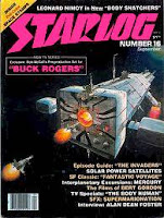
Starlog #16 coverI found a couple of sites that document Robert McCall's involvement with the new Buck Rogers TV show in the early 80s. The "look" of his designs are very different from what was then the "look" of spacecraft on film. It should be noted that the original concept of the show was somewhat different from the initial version of Buck Rogers, at least for the first season. Instead of Buck constantly battling the forces of the alien Kane or some other space megalomaniac, he was instead to be part of an exploratory mission tied to a large mother ship scouting about the galaxy. I guess one shouldn't be surprised then that that is exactly what the second season of Buck Rogers more closely resembled. The illustrations were originally published in Starlog magazine while the concept was being developed.
Comparison of McCall flagship design to Jeffries Leif Erickson
Constitution (right) and the Leif Erickson (as UFO mystery ship, on left)
   While valid designs for the plots described, the designs seem dated somehow. For example one of his sketches for the large cruiser "Constitution" is reminiscent of some of Matt Jeffries'  60's design for AMT's Leif Erickson model kit. The show's fighter, looks more like a bomber with a huge cabin and gun turrets, much like a scaled up version of an Interceptor from Gerry Anderson's TV show "U.F.O"  from 1970 (when mentioning brit TV I feel a deeply compelling reason to call them a "programme" and not a "show", curious). Many of the designs are also similar to the designs he created for Disney's "The Black Hole" around the same time.


     Perhaps the dated aspect is in that the designs are actually rather curvy and relatively smooth, not filled with tons of greeblies as sci-fi ships at the time (and still are). At the same time they do have pointy bits like fins, antennas or landing gear jutting out. If they had been adopted it would have been different from many of the kitbashed designs that were on television at the time (I always hated recognizing on spaceships bits and pieces of something on my model shelf). Designs like these would currently be seen as "retro" I suppose. At any rate these designs did not find their way into the show and were really just by his own admission (see"film sketcher" entry for 2/12/12) a few quick sketches that were requested based on a story pitch. McCall was never hired on during production.

     More information about this artwork is detailed at Christopher Mill's Space 1970 blog article which details much of the original concept for the show. The development of McCall's concept art is detailed at the Film Sketchr concept art blog article. There's also a brief pair of entries on this at MyDelineatedLife.blogspot.com (Thom Buchanan's art blog); part 1 & part 2.

     In the end, the hero fighter in the show was the result of a discarded design of Ralph McQuarrie's for the Battlestar Galactica Viper space fighter. I haven't found much other information on the origins of some of the rest of the fleet, although the physical model work was done at Universal Hartland, Universal effects house at the time. The look of spaceships on the show in the end was very similar to that of it's sister show "Battlestar Galactica" consisting of heavily kitbashed designs with lots of little fiddly bits tacked on (although occasionally odd designs would appear such as the shark fighter which was basically an orange shark with a rocket, rather neat).

Sunday, February 12, 2012

Buck Rogers Space Cruiser

The 25th century's magic bus

As a small child I remember that I followed the adventures of both Flash Gordon and Buck Rogers as the serials were shown as filler in kid shows along with Our Gang comedies and cartoons. Recently I found that the original Buck Rogers Universal serial has been made available as a feature on Hulu and other free video streams out there in the form of a compressed version made in the 50s called "Planet Outlaws". Yes, the acting/writing is pretty awful. The re-editing of the multiple episodes into just over an hour also make it rather confusing at times. It also gets rid of many of the action scenes, which admittedly were there only to pad the story out to several episodes with cliffhangers. On the other hand given their budgets and state of the art, the special effects are not totally awful. Yes, basically models on strings and sparklers out the back.
Simplified side elevation of Buck 
Rogers' cruiser
The 25th century Interplanetary Earth Cruiser
The designs on these old serials do have an appeal to the model maker as an example of "diesel punk" style. I also had something of a challenge. I had again volunteered to do the model in an hour workshop for Arisia '12, and not wanting to do the Probert shuttle again, I decided to try something new. The Buck Rogers cruiser seemed to fit the bill.
     The workshop went off rather well, but a couple of problems with the design came up, so I tweaked the model a bit to help improve assembly.  I also added a stand to make this rather simple ship look a bit fancier (So to the participants, sorry for the delay...this took longer than I thought).

The Model

This version of the model is a simplified version of the Earth Space Cruiser seen in the serial. There are a variety of reasons. For one thing, I could only work off the available video streams and so the quality of the scenes are rather poor. Secondly, this initial version needed to meet the build in an hour requirement and minimize resources. I also needed to keep it to just 2 pages.
    Given that there is a villain in the piece as well and both ships are nearly identical, I figured, what the hec. So I added a new page 2 that allows you to build Imperial Cruiser, which is basically the same ship but with serrated fins. I made a few additional changes to help differentiate the two which shouldn't change the instructions significantly except for the fins which assemble differently (see next paragraph).
     The fins assemble differently from the original in that because of the serrations they can't be folded over the top. Instead the vertical fin is folded from the bottom, but the side fins come in upper and lower halves (o/u) and starboard and port sections (s/p). The step for attaching these side fins differs in that you need to glue the lower halves to the tab onto the ship assembly first (note, that the lower fin has a tab that should fit under the plate overhang). Trap the tab by gluing the top half on top. An alternative method is gluing the upper and lower half together only at the outer edges, and then apply with a toothpick glue within the slot and tab and slip over the tab on the ship assembly.
    Another "model" I added to this package was an appropriate stand for either model. Very art deco, it comes in one page and should be printed on cardstock or glued onto cardboard before assembly. You will need to cut the rectangular name plate from the ship pages to put the name on the stand. The stand assembly should be relatively self evident, but a simplified assembly guide was printed on it.
  • The stand which might work with other models as well with a little modification (Google docs preview seems to show it blank, but it does download ok)
     The model scales roughly to 1/120. I'm thinking about eventually scaling this up to a 4 page version that would address some of the simplifications of this version, but if you are looking for a simple kit that requires little experience or time, these should be pretty good.

Suggestions & hints

There are several limitations due to the scale and the need for simplicity, but you may consider the following suggestions to get a better finish on the model. While the kit is designed for a fast build,  a well finished model depends on neatness that comes with taking your time; i.e. avoid picking up wet glue on your fingers and then putting it all over the model. Another thing is you can camouflage joins by using a colored pencil along exposed card edges to help it blend with the part colors. The rocket exhausts are tricky to form from cardstock, so feel free to use the card part as a template for cutting out of lighter paper, or even using coffee stirrers instead. Tabbed kits, particularly at this scale will often show slight joining problems when finished, so consider using either small sharp scissors or a sharp hobby knife to trim excess parts (but do so carefully).
   While the serials are black and white, the Buck Rogers comics often show ships in wild colors, so feel free to color the parts in as you wish or spray the ships gold or silver. At this scale, building several of these for a mobile is also practical (particularly combined with some of the other "retro" rocket kits available out there (see Tor's Stubby and Cthulhu's "retro rocket" (also a rocketship XM there).
 

More Info...

You can back track to last year's article for the workshop which includes the ST-TMP shuttle concept (start's here) or download the shorter pdf document. Also visit my Zizzerz 'n Mizzilz page which tries to organize my postings on modeling.
    As for the ship itself, struggle through that serial!

Friday, January 06, 2012

Sci-Fi spaceships at a loss vs. reality?...well, sort of

Fact vs. Fiction

One of the more active forms of debate in many Sci-Fi modeling forums is the "reality" of many of the spaceship designs we have come to know and love. It can also appear, particularly to those just on the periphery of this niche in fandom, a bit childish and inane. Still, particularly in film where these ships are actually seen - inside and out, there is a certain fan that wants to know exactly how it works and how everything fits. Of course rarely does this actually matter to the actual producer of the imagery since what they really want is essentially an aesthetic effect. It isn't a government contract for an actual working model!
    I have also found myself caught up in this kind of speculation, wasting a lot of time on practical configurations, mission profiles, fitting internal spaces, counting pixels, and estimating sizes. What makes this rather silly is that I am not an aerospace engineer, so what do I know about the minimum thickness of a spaceship pressure shell or the required amount of radiation shielding. I also am quite aware of the fact that the original producer may not really care.
    Recently I found an old copy of Air & Space magazine which had an engineer's perspective on some landmark Sci-Fi ships. Another book I took out of the bookcase was the Starflight Handbook which goes into great technical detail about the physics of distant space travel. This rekindled a topic that I hadn't gotten to write about during my previous spaceship posting. While I'm no expert, I do know enough science to know that some things do bug me when I see them. On the other hand, reading up on these bugbears allowed me to see that they may not be as heinous as one might think.

You don't need no stinkin' intakes...

Ever since Star Wars, it seems that there isn't a space opera that doesn't have the one-person fighter, and that fighter has these huge intakes. The question is that in space, what are they intaking? Some spaceship designs even incorporate intakes into large vessels. Various Star Trek designs incorporate slots and other "flush" vents as if something was meant to pass through them (curiously the main thing that is understood to be a necessary intake, the Bussard collector, doesn't look much like an intake at all!).
    The argument is often made that these designs are meant to work in an atmosphere as well as space, and as such intakes make some kind of sense. But then you get odd contradictions, namely that to operate at high speeds in a dense atmosphere you need to be streamlined or suffer very high stresses, and yet given the tendencies to make designs very "greeblied" the surfaces of these ships are not suited for atmospheric travel at all.
    I suspect the intakes are there because they are familiar with our idea of fighter design. They convey a sense of power and energy. While we may all have flown in jet aircraft, the fighter jet conveys a sense of power that is visible in the proportion of the intakes and the exhaust to the overall size of the aircraft. One cannot just dismiss that idea from a design of a fictional fighting craft. A fighter plane is basically an engine with wings (in fact in many designs, fuel is such a small part of the design that many fighters aircraft are said to be in a fuel emergency right after take off).


Intake/Exhaust to general aircraft shape ratio has its limits as far as looking "fast" as the real life Caproni Stipa or Flying Barrel illustrated (another example is the McDonnell "Goblin")

If one looks at the rocketship designs from the 30s one can find them full of exhaust manifolds and long curved stacks that were prominent in airplanes and sports cars at the time. The ring of rocket exhausts around Flash Gordon's rocketship look a lot like the ring of cylinder exhausts you would have found on an aircraft radial engine at the time.  I'm sure that in that time period, the look of huge aviation and automotive engines conveyed that same sense of power that huge intakes and exhausts do to us now.

...or do you need the intakes after all

One of the biggest problems in affordable space flight is the ratio of propellant mass to total mass. Currently, the requirements are well above 90%, which is why single stage to orbit is so darn difficult. One of the ideas to solve this problem would be augment the propellant with air in the lower atmosphere. These proposed boosters would actually have what look like oversized jet engines. This airflow to the combustion engines is meant to lower the amount of oxidizer and propellant needed as this airflow mass is accelerated along with fuel.
Sketch of imagined launch of Aries on air augmented booster
My daydream of an Aries type orbital shuttle being launched after assembly by an air augmented "Nova"-like booster like some gigantic shuttlecock.
The Profac or propulsive fluid accumulator was meant to be an orbiting fuel collector. The basic idea is for an active orbiter that would skim the upper atmosphere and with its intake scoop out oxygen and nitrogen to preclude the high costs of actually launching this material into space. While it's main propulsion system to compensate for drag would use ion power, the design would contain conventional boosters that could make use of its haul for fuel for more energetic boosts.
    Another idea is to use a space based system to beam microwaves or lasers to your ship. The ship would use the energy to ionize gas and so create thrust. In some cases (not all) such a ship would also use intakes to collect air as it accelerates in the lower atmosphere. The advantages of such a ship is that it limits the propellant requirements to what would be needed to reach final velocity outside the atmosphere (but note, it still wouldn't need oxidizer as the energy would come from the beam, not the propellant).
    All starship fans know of the Bussard Ramscoop Ship. The premise is akin to a ram-jet engine. Normally a jet engine uses sets of compressor blades to gather and compress air for combustion. If on the other hand the engine is moving at a certain rate of speed, the mere act of forward motion would allow it to collect and compress the necessary air. Similarly while there isn't enough free hydrogen to easily run a rocket in space, given enough speed, a ship could cover enough volume of space that it could conceivably collect the necessary fuel from interstellar space. To do this it would need an intake. While a practical intake would have to be hundreds of kilometers wide (which from the point of view of an illustrator, a bit of a problem), this intake may be made from magnetic field lines instead of being physical. Designing a ship with intakes therefore may not be that crazy after all.

The Center of Gravity

One of my pet peeves about some designs is the way the thing appears to balance. A classic example is the USS Enterprise itself. A casual look at the position of the impulse engines suggest a fairly high position for applying an impulse. Unless the warp engines are rather heavy, the impulse engines would tend to flip the ship head over heels (Of course the impulse engines themselves may also work in some very weird way).
    Many ships for the purpose of appearing rakish or sleek do seem to make use of a certain off-center look. The appearance is sometimes based on the look of sports cars, which of course have different balance issues since they are grounded on their wheelbase. Even aircraft can appear to have off center lines, but the imbalance is an illusion as aircraft are not just balanced against gravity, but centers of lift and drag (which can vary with speed).
     Asymmetry is possible and interesting to look at, but I feel (and this is really personal) it needs to have some aspect to the ship to justify some form of balance (i.e. the centers of mass, lift, thrust, drag, etc., should match).
The Blohm & Voss BV 141, perhaps the most asymmetric aircraft ever flown. Another notable asymmetric aircraft was NASA's AD-1 Oblique wing concept and an unfortunate F-15 that lost its wing and yet still managed to land safely.
Is power an issue?
On a personal point, I can't bring myself to have too much of an issue with power, at least as far as an artistic portrayal of a spaceship is concerned. The fact is that the amount of power required to move anything over the vast distances of space is far beyond most of our means (at least in a reasonable time for the plot). For the purposes of plot, whatever that power source is, the power source is both very powerful and very small.
    That said, given that the ship may need some fantastical source of power, how should that be portrayed? Sometimes it is shown as huge engine bells exhausting white light, or it could be the sheer size of the engine assembly itself. Paintings by Robert McCall or others may portray bright streaks of white, red or yellow to indicate the propulsive energies involved (the cover of the original Star Trek novelization show streaks of flame shooting out of the Enterprise's nacelle's and hull).
    The funny thing is that the reality is probably much less dramatic. An engineer in the Air & Space article noted that while he thought the Discovery from 2001: a space odyssey was among the most realistic designs shown on film, the engine bells were just much too big. Our impression of big rocket engines comes from the huge Apollo F1 engines which you can see at the Smithsonian, but these engines were designed to operate in the atmosphere. In space these engine bells would have been substantially smaller.
     Another decrease in drama is that engines don't have to fire constantly in space unless you are changing direction or speed. We have gotten used to idea that if "it's moving" then "the engine is on" from our earthbound experience, but really, once the Galactica is in motion, it's in motion until some external force acts on it.
     This means that the reality is that engines can be fairly small in appearance and hardly ever on, so a ship in space looks pretty inert. On the other hand, there's nothing like engines at full thrust to suggest impending adventure. The fastest moving object in space currently is Voyager 2, and it doesn't look substantially different from the one hanging in the museum.
Boring ship going on momentum vs. Exciting ship going full blast

The Details

Finally the thing that often gets in the way of taking some design seriously is the details. Sometimes just basic physics, for instance why don't ships have reaction control systems. Well, it has been interesting to note that they are not always totally absent. The original Enterprise had no visible RCS anywhere, but this was rectified when it was revamped for the "Motion Picture" version. Still, they are often missing in many popular designs and artwork.
Fictional RCS (L-R):2001(pod), Star Trek, Space 1999, Galactica (reboot), Hyperdrive
     It is actually possible to control attitude without reaction jets and this is with internally mounted gyroscopes(control moment gyroscopes). Anyone who has played with gyroscopes has noted their ability to react against changes in orientation. This is the way the International Space Station controls its attitude.
     Another interesting aspect of real spacecraft not often shown is that the vacuum of space actually makes it very difficult to loose heat. The active use of electronic equipment and power generation will create waste heat which if allowed to build up could be catastrophic (and that is without even mentioning the waste heat a compact source of fantastic energy must have). While designs do sometimes appear with solar panels, they are not often shown with corresponding radiators. This is perhaps because we (i.e. the general public) don't often associate radiators as a vital aspect of spaceflight, although it is sometimes some of the most visible parts spaceships taking on the appearance of fins and winglike appendages
    Stanley Kubrick deliberately removed the radiators from the original design of the Discovery in 2001 in spite of the fact that such a nuclear powered ship would require huge radiators. Kubrick was concerned that the spacefaring ship not be identified as having fins or wings like so many earlier science fiction film rockets.
    The need for some form of radiators can be taken to heart by all those who want wings of some sort on their vacuum bound spaceships. They are not wings, they are radiators. I always thought that was what those big black panels on Tie fighters were anyway (regardless of what those "technical" references might say).
    The list of details can go on and on: Where is all the propellant mass stored? Where's the shielding? Where's all the food and water? Where's the head?

So how does fact relate to fiction

Curiously much of what we can consider lapses in design can be explained away in some manner shape or form to at least a minimal extent,  and not always with technobabble. Sometimes it may be reasonable for a ship to lack RCS or have intakes. As mentioned in a previous article, the up/down consistency of a ship in space may be necessary to keep the crew from getting sick. An apparent imbalance in some design may be justified by re-interpreting what appears to be the case, such as the way masses may really be distributed in the design, at least as far as the original designer was concerned. It is also important to note that any society that can propel a spacecraft across light years probably knows how to deal with artificial gravity, radiation shielding, and high speed particle erosion.
    Perhaps the most important thing to keep in mind is that these are not real ships. The reason they look the way they do is to convey a feeling or an overall atmosphere for a story. They exist to convey characters from point A to B, or place them in a setting that is outside of our general experience. These things need to be by definition fantastic. Our fascination with these "spaceships of the mind" is in how wonderful we find them. Their limitation to facts and science is only so far as their creator's attention to the facts help suspend disbelief, which is the key point of a fictional ship. After all is it any more or less believable that we may someday live and travel far and wide through space versus the idea that three women, a culinary student, a masseuse, and one with a somewhat checkered working status, can afford to live in a large three bedroom Manhattan apartment with cathedral ceilings and a large balcony (now that's fiction).

End Note

Just to make a note of some of the references used which can be interesting points of departure from this article. For one thing a reader may refer back to the previous spaceship design articles and the final reference posting created for it (particularly good is Atomic Rocket). The original article that started this off was "Planet of Origin: Hollywood," by Dennis Meredith, Air & Space Magazine, 4:1:pp80. Another handy reference in the bookshelf was the Starflight Handbook by Eugene Mallove & Gregory Matloff (Wiley Science, 1989). An interesting web site that I came across while looking up info on Bussard Ramscoops and Profac was This is Rocket Science (my original reference was my old copy The Illustrated Encyclopedia of Space Technology, Kenneth Gatland et.al. 1981). While there is always The Physics of Star Trek  by Lawrence M. Krauss (Harper Collins 1995), this time I spent more time with The Cosmic Dancers by Amit Goswami (Harper Row 1983). The most comprehensive collection of how Hollywood gets all this stuff wrong on the web is probably Phil Plait's Bad Astronomy.
    I guess my own final note is a weird sort of recognition that the articles in my old books that date back 20-30 years still fair pretty well in the realm of speculative spaceflight and rocketships (yes there's stuff that's missing, but still...). Is that good or bad?